
http://zenzmurfy.deviantart.com/art/Harrington-Treecats-437778098?q=gallery%3Azenzmurfy&qo=2
Cute not a gargoyle want-to-be.
Poker


Users browsing this forum: No registered users and 1 guest
| Re: (STICKY) From the comic book writer | |
|---|---|
|
|
|
|
pokermind
Posts: 4002
|
Saw your company's posts on DA. Noticed blue chrome treecat and Devil 'cat not among them. There was another blue treecat posted on DA just prior that will bring a smile not revolution among treecat fans:
http://zenzmurfy.deviantart.com/art/Harrington-Treecats-437778098?q=gallery%3Azenzmurfy&qo=2 Cute not a gargoyle want-to-be. Poker CPO Poker Mind
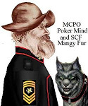 and, Mangy Fur the Smart Alick Spacecat. and, Mangy Fur the Smart Alick Spacecat."Better to be hung for a hexapuma than a housecat," Com. Pang Yau-pau, ART. |
| Top | |
| Re: (STICKY) From the comic book writer | |
|---|---|
|
|
|
|
Spacekiwi
Posts: 2634
|
Welcome to the forums Matt.
`
 ~~~~~~~~~~~~~~~~~~~~~~~~~~~~~~~~~~~~~~~ its not paranoia if its justified... ~~~~~~~~~~~~~~~~~~~~~~~~~~~~~~~~~~~~~~~ |
| Top | |
| Re: (STICKY) From the comic book writer | |
|---|---|
|
|
|
|
MaxxQ
Posts: 1553
|
<sigh> Nothing in the mail today. Guess it'll be here tomorrow.
Dammit!!! =================
Honorverse Art: http://maxxqbunine.deviantart.com/ Honorverse Video: http://youtu.be/fy8e-3lrKGE http://youtu.be/uEiGEeq8SiI http://youtu.be/i99Ufp_wAnQ http://youtu.be/byq68MjOlJU |
| Top | |
| Re: (STICKY) From the comic book writer | |
|---|---|
|
|
|
|
John Prigent
Posts: 592
|
Tomorrow? I should be so lucky. Mine from Forbidden Planet here in the UK have only just been posted to me so I'll be lucky to see them before Monday. So who else ordered all four covers?
Cheers John
|
| Top | |
| Re: (STICKY) From the comic book writer | |
|---|---|
|
|
|
|
Yow
Posts: 348
|
Me. Cthia's father ~ "Son, do not cater to the common belief that a person has to earn respect. That is not true. You should give every person respect right from the start. What a person has to earn is your continued respect!" |
| Top | |
| Re: (STICKY) From the comic book writer | |
|---|---|
|
|
|
|
Norm.bone
Posts: 83
|
I hear what you're saying, SWM, but the physical comic lettering seemed thinner and more irregular than in the preview. The preview was easy to read, the comic more difficult. |
| Top | |
| Re: (STICKY) From the comic book writer | |
|---|---|
|
|
|
|
PeterZ
Posts: 6432
|
I LOVE the Treecat on the Flickr site. That is perfect! |
| Top | |
| Re: (STICKY) From the comic book writer | |
|---|---|
|
|
|
|
MaxxQ
Posts: 1553
|
I'll be sure to pass your compliment on to Christy. =================
Honorverse Art: http://maxxqbunine.deviantart.com/ Honorverse Video: http://youtu.be/fy8e-3lrKGE http://youtu.be/uEiGEeq8SiI http://youtu.be/i99Ufp_wAnQ http://youtu.be/byq68MjOlJU |
| Top | |
| Re: (STICKY) From the comic book writer | |
|---|---|
|
|
|
|
MaxxQ
Posts: 1553
|
Back on-topic.
I finally got the comic in the mail today, although I didn't realize that what I pre-ordered was issue #1 in four different covers. Oh, well. Not really complaining. So, on to my critique. Since this is Matt's thread, I'll start with the writing. Writing: Overall, not bad at all. Considering the source material, and the restructuring of the story to fit a comic format, it works. No complaints at all on that front. Art: The art is good. The painterly style looks nice, and the in-space scenes look *really* good. Designs: This is the major thing, IMO. It's been implied elsewhere that the comics are kind of a testing ground, and that over time, certains aspects of the design will change. I hope this is what actually will happen. Because of my bias, I would prefer that the ship designs move closer to canon. Some of the ships in the comic look pretty good, and fairly close to canon, but others don't. One thing I would like to see is that ships from the same Star nation retain the same design cues no matter what class they are. What I mean is that an SD should look very similar to a light cruiser, with only the number of weapons mounts distinguishing them (if apart or shown seperately, and by size if shown together). I don't really have any problems with the station(s), since I've never held a clear view in my mind of what they may look like, aided by the canon assertion that they were pretty much a hodgepodge of add-ons as needs arose. Uniforms look good, and I have no problems with combining the uniforms and skinsuits. Not sure about the skinsuit helmets, though. They look too much like goldfish bowls, but for a comic-style visual medium, I suppose they work. Nimitz: All the usual objections still stand - too big (although not as bad as that pic on the website with Nimitz hanging on Honor's back), no fur, extra appendages on his head need to go, needs to look more cute and cuddly when not in buzzsaw mode. Related to the writing, I would like to see him respond to Honor more - he doesn't at all in this first issue. It might help non-fans to get the idea that he is more intelligent than people think. An occasional <bleek!> would do nicely, especially in response to something humorous someone said. I could wish for more pages per issue, but that's just me being greedy and impatient, and I understand (in a general way) the costs of doing this sort of thing. Final verdict: I like it, and will probably continue to buy the new issues as they come out, but with the caveat that I would like to see some things change. Not expecting complete canon, but just get the look a bit closer. On a side note: In an "official" review I read last night, one reviewer mentioned that Honor was royalty. Until I read the comic today, I had no clue how that reviewer got that impression. Now I *do* see how it happened, and have to say that the reviewer must not have picked up the sarcasm. Especially since a page or so later, Honor comments that she had to work her way up to command because she wasn't noble-born and didn't have the patronage that people like Young have. =================
Honorverse Art: http://maxxqbunine.deviantart.com/ Honorverse Video: http://youtu.be/fy8e-3lrKGE http://youtu.be/uEiGEeq8SiI http://youtu.be/i99Ufp_wAnQ http://youtu.be/byq68MjOlJU |
| Top | |
| Re: (STICKY) From the comic book writer | |
|---|---|
|
|
|
|
yannosh
Posts: 186
|
So, Mat, welcome to the asylum, you may check your sanity at the door.
On the serious side, my thoughts - for the most part I liked it. the storytelling flows nice for the medium, the art is quite fetching. For critiques I have only three. two minor and one major. 1 - there is young Honor, the flavor text of her mind telling us she was never beautiful - wile looking like a wet dream. Major dissonance there, and one that could have been easily rectified by a simple rewording - "I never believed myself beautiful." instead of "I was never beautiful." 2 - As MaxxQ said, certain uniformity of design of the ships of the same navy is expected. So far, your artists seem to have gone for trying to give ships certain uniqueness that is wholly unnecessary, and frankly would have been ill advised practice for any professional military. 3 - Nimitz. No. just no. I already expressed myself on the matter and I will reiterate. That nightmare inducing monstrosity is not Nimitz. This is not simply a matter of him not matching my mental image of the character. It goes fully into mutilation. Too big, too hairless, too ugly, too reptilian... and he feels like a prop, not a full character in his own right. And whatever your artists and designers think, no it most certainly does not look cool, except perhaps to Gothic aficionados. I am sorry if my last point came as too ranty. But whereas I can fully accept the need for reimagination, reinterpretation and adaptation necessary when switching mediums, I feel that what you did with Nimitz was an utter failure at all three. Frankly, you went way overboard. =-.--.--.*.--.--.-=
Ceterum censeo Foedam solariam delendam esse. Even the best in the world cannot measure up to a dozen highly motivated good-enoughs. |
| Top | |