bunyipbelle wrote:The shoulders of the uniform should be padded for Nimitz to sit on. That is very important.
You dont want to have the new Nimitz on anyones shoulders.


Users browsing this forum: No registered users and 7 guests
| Re: How do you Like the Illustrted Novel Uniform? | |
|---|---|
|
|
|
|
Star Knight
Posts: 843
|
You dont want to have the new Nimitz on anyones shoulders. |
| Top | |
| Re: How do you Like the Illustrted Novel Uniform? | |
|---|---|
|
|
|
|
Borealis
Posts: 63
|
I don't at all care for the uniforms on the covers, and prefer the Bu9 version. However, someone early on made the comment that the black and gold Bu9 version is a dress uniform.
Using today's navy as an example, officers and senior enlisted normally wear khaki's and junior enlisted wear that black and blue camouflaged working uniform. It's a case of form follows function. Supervisors need to be immediately identifiable and don't have to worry about getting dirty. Worker bees have to have something durable where it doesn't matter if you get hydraulic fluid (or the Honorverse equivalent) all over it. Having said that, all uniforms (officer and enlisted) do wear rank insignia and name tags and the cover outfit doesn't have either. I could tolerate the cover uniform if they add rank insignia and nametags, do something about that ridiculous belt buckle, and ditch the tails. Again, make it at least so form follows function. |
| Top | |
| How do you Like the Illustrated Novel Uniform? | |
|---|---|
|
|
|
|
Howard T. Map-addict
Posts: 1392
|
::a Naughty Moose replies::
You forgot the "don't care" option. Naughty Moose, too nearsighted to notice any differences
|
| Top | |
| Re: How do you Like the Illustrted Novel Uniform? | |
|---|---|
|
|
|
|
Dca
Posts: 134
|
Not sure if a skinsuit is a "uniform" in this sense, or if this should be in a separate topic. I really don't like the armored graphic. It looks too ... armored. I thought the fabric itself was supposed to be penetration-resistant.
I was picturing something a lot more like the BioSuit: http://www.nasa.gov/offices/oce/appel/a ... esuit.html http://mvl.mit.edu/EVA/biosuit/ |
| Top | |
| Re: How do you Like the Illustrted Novel Uniform? | |
|---|---|
|
|
|
|
BrightSoul
Posts: 1368
|
A Hint for our friends at Evergreen.
Paying attention to the little details keeps geeks interested. Things like rank insignia, patches, the White Beret are those kinds of details. Look to the kind of effort put into the LoTR properties for examples. Mr. Weber's work has tons of those little details that your new fans will pickup on as the series continues and the old fans will love. Not only that but think about all the RMN ship patches you could sell. The cut and style of the uniform doesn't bother me if the more important details are there. Timeless design keeps a property relevant longer, this seems trendy. Like many others I suggest a little more tip of the hat to the age of sail, not the hats of course. |
| Top | |
| Re: How do you Like the Illustrted Novel Uniform? | |
|---|---|
|
|
|
|
Jeroswen
Posts: 109
|
I agree that the uniform must look like a uniform. I don't know how many times my wife, a decidedly non-geek, has commented, "Do any of YOUR shows not have PJ's for uniforms?" When I asked her if it was the material of the uniform she replied "No, its the lack of rank, job classification, and name". Most people have a relative that is either serving or has served in the military. They know why its necessary to have those 3 critical items on a uniform, especially in the Navy where you don't have to contend with snipers. I would like to add that I hope the dress uniform is put in the movie. The uniform should look really sharp and professional. It would be just another cue, albeit visual that she is a professional. |
| Top | |
| Re: How do you Like the Illustrted Novel Uniform? | |
|---|---|
|
|
|
|
Spacekiwi
Posts: 2634
|
With a Brother in the navy, and a long time sci fi fan, thats what always puts me off: the civilianishness of the so called military in the future. Cool looking uniforms are great. uniforms that are less bulky and protect pretty damn well, as described in the Honorverse are even better. But the uniform designs that have no insignia, rank, or epaullettes, or any way to show rank, is offputting. You need to be able to tell who you have to take orders from, and a lack of insignia prevents this.
`
 ~~~~~~~~~~~~~~~~~~~~~~~~~~~~~~~~~~~~~~~ its not paranoia if its justified... ~~~~~~~~~~~~~~~~~~~~~~~~~~~~~~~~~~~~~~~ |
| Top | |
| Re: How do you Like the Illustrted Novel Uniform? | |
|---|---|
|
|
|
|
pushmar
Posts: 144
|
Apparently, "Working with the Korean studio has been challenging since none of the artists speak English."
http://www.comicbookresources.com/?page ... e&id=50341 That may explain a lot of discrepancies between the artwork and our expectations. |
| Top | |
| Re: How do you Like the Illustrted Novel Uniform? | |
|---|---|
|
|
|
|
MaxxQ
Posts: 1553
|
Lots of WIP and concept art in the video there. Some of it looked decent, but I can see where some people are going to go ballistic over it. Especially the WHJ art. =================
Honorverse Art: http://maxxqbunine.deviantart.com/ Honorverse Video: http://youtu.be/fy8e-3lrKGE http://youtu.be/uEiGEeq8SiI http://youtu.be/i99Ufp_wAnQ http://youtu.be/byq68MjOlJU |
| Top | |
| Re: How do you Like the Illustrted Novel Uniform? | |
|---|---|
|
|
|
|
pokermind
Posts: 4002
|
from http://www.comicbookresources.com/?page=article&id=50341
Hmm I bet David Weber loved that. One hopes the blue scary Nimitz etc stay in Korea least we see fans with pitch forks and torches Poker CPO Poker Mind
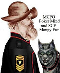 and, Mangy Fur the Smart Alick Spacecat. and, Mangy Fur the Smart Alick Spacecat."Better to be hung for a hexapuma than a housecat," Com. Pang Yau-pau, ART. |
| Top | |