Topic Actions

Topic Search

Who is online

Users browsing this forum: No registered users and 58 guests

Comparison of US Job Statistics

The Management is not responsible for the contents of this forum. Enter at your own risk.
Comparison of US Job Statistics
Post by thinkstoomuch   » Tue May 03, 2016 6:36 am

thinkstoomuch
Admiral

Posts: 2727
Joined: Mon Aug 24, 2009 1:05 pm
Location: United States of America

This graph shows part of the reason that a like population to employment rates. Vice participation rate.

Image

Way I got there was checking up on Mike Rowe's numbers. Then got curious by a trading economics web page. And country comparisons. Which are even more interesting.

Though I do wonder about those job openings and why they are unfulfilled. Is it because there are no people qualified for them, is that want to pay to low or some other reason. Though the first seems ridiculous based on the information in that Seattle study. The unfulfilled jobs are ~3+% of the total employment number for the US.

Though the latest trend is somewhat interesting.

Oh well something for you all to think about,
T2M
-----------------------
Q: “How can something be worth more than it costs? Isn’t everything ‘worth’ what it costs?”
A: “No. That’s just the price. ...
Christopher Anvil from Top Line in "War Games"
Top
Re: Comparison of US Job Statistics
Post by biochem   » Fri May 06, 2016 9:42 pm

biochem
Rear Admiral

Posts: 1372
Joined: Thu Aug 19, 2010 8:06 pm
Location: USA

The increase in job "openings" make it look like there are more jobs than can be filled. That doesn't match with my personal experience. And I was remembering various caveats which I have heard to this data over the past few months.

1. The population is also increasing and the job increase is less than the population


Per Capita jobs
Image

2. Employers/hiring managers are filling jobs more slowly.

Image

This also matches with my personal experience. The people I know who are hiring are looking for the perfect person because 1) this may be the only hire their company lets them make for years, so they feel that they can't make a mistake 2) in good times they'd have to wait forever to find someone who meets their preconceived ideas of an ideal employee, so they make due with someone who is good enough (and in some cases the good enough employee winds up actually being better than the so called ideal one would have been, people don't think outside the box enough). Now times are just tough enough that they can get that so called ideal employee if they wait a bit 3) some of those openings aren't real. I know people whose companies are posting jobs they have no intention of filling just to make the company look growing and vibrant.

Image

Recruiting intensity is how hard companies are working to find job candidates i.e. not hard. Which also fits from what I've observed. Hiring fairs are anemic. Ads are minimal, basically just internet postings. A lot fewer headhunters etc.
Top
Re: Comparison of US Job Statistics
Post by thinkstoomuch   » Sat May 07, 2016 6:13 am

thinkstoomuch
Admiral

Posts: 2727
Joined: Mon Aug 24, 2009 1:05 pm
Location: United States of America

biochem wrote:...snip...


First thank you for the response.

The first graphic is more or less contained in the chart I posted(red line measured against right scale). Though oddly enough yours shows a downturn at the end and mine didn't. Went and looked (yesterday was US Job Report day, notice how much press it got?) changed it.

A plausible explanation. Though the part about recruiting intensity may or may not really be valid. Just do to the age of the data. It stops at more or less 2012.

There is this article from 2014 presents the data to 2013.

http://wol.iza.org/articles/recruiting-intensity.pdf

Not sure what to make of it. I will have to contemplate it. Has a good chart back to 2001 on the second page.

I may need to poke around some more in the BLS stuff to check Mike Rowe's view on things. He is mainly focused on the type jobs that are hard to export. Plumber in China doesn't do much good in Omaha. ;)

Thanks again,
T2M
-----------------------
Q: “How can something be worth more than it costs? Isn’t everything ‘worth’ what it costs?”
A: “No. That’s just the price. ...
Christopher Anvil from Top Line in "War Games"
Top
Re: Comparison of US Job Statistics
Post by thinkstoomuch   » Mon May 09, 2016 7:06 am

thinkstoomuch
Admiral

Posts: 2727
Joined: Mon Aug 24, 2009 1:05 pm
Location: United States of America

Not entirely sure how to read these things. But here is a comparison of hires and openings in various categories since the stat has been tracked.

Image

Image

Image

Those three seem to account for 50% of the job openings currently. If you go to http://research.stlouisfed.org/fred2/gr ... data-tools and enter either hires or openings in the add line box you can look in more detail.

For recruiting if you are hiring more than the openings. Why the need to recruit? Save the money.

Another look at things is.

http://www.bls.gov/web/jolts/jlt_labstatgraphs.pdf

I thought chart 7 was interesting. Something like more than 1.5 times as many people quit as were layed off or discharged, currently.

Have a good week,
T2M
-----------------------
Q: “How can something be worth more than it costs? Isn’t everything ‘worth’ what it costs?”
A: “No. That’s just the price. ...
Christopher Anvil from Top Line in "War Games"
Top
Re: Comparison of US Job Statistics
Post by HB of CJ   » Thu May 12, 2016 12:27 pm

HB of CJ
Captain of the List

Posts: 707
Joined: Thu Jul 11, 2013 10:46 pm
Location: 43N, 123W Kinda

I remain confused with verbiage, wordage and the unusual presentations, along with the various non comprehensible graphs. I do not understand.

Can you explain it more simply? And why is it significant? I am not groking it. I'm NOT understanding what is being presented and why. Respectfully. HB
Top
Re: Comparison of US Job Statistics
Post by thinkstoomuch   » Thu May 12, 2016 2:39 pm

thinkstoomuch
Admiral

Posts: 2727
Joined: Mon Aug 24, 2009 1:05 pm
Location: United States of America

HB of CJ wrote:I remain confused with verbiage, wordage and the unusual presentations, along with the various non comprehensible graphs. I do not understand.

Can you explain it more simply? And why is it significant? I am not groking it. I'm NOT understanding what is being presented and why. Respectfully. HB


Not organized enough in my thoughts as per usual.

Another smaller graph.
Image

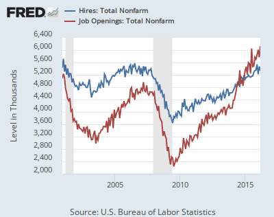
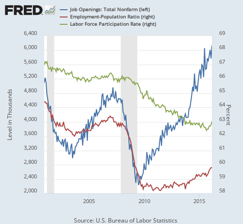
Job openings have been lagging hires since the stat started back around 2001.

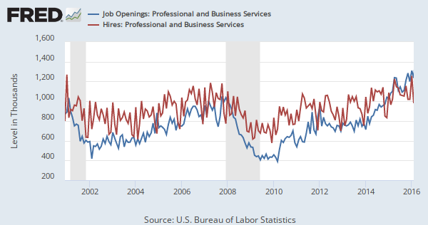
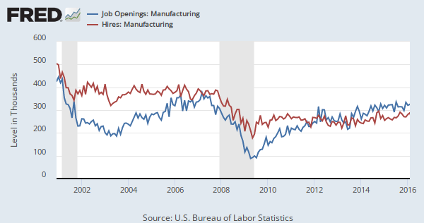
Part of it is Mike Rowe is smoking crack. At least a little. The trade jobs openings are only about 20% of the total openings and hires(may be slightly better).

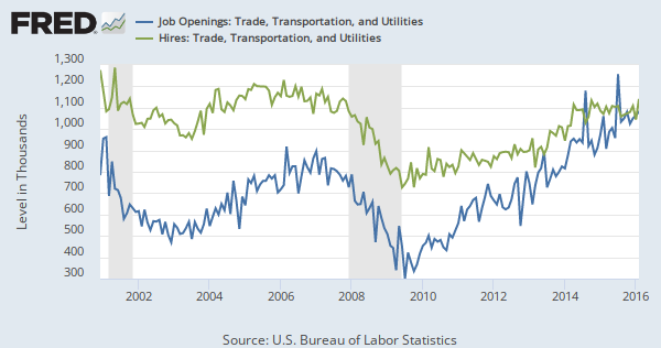
The last set of graphs was trying to show where the hiring and openings were in the specific parts of the job market.

This was in relation to biochem's point about recruiting. But after thinking about it pretty much applies to all of it.

If you are hiring more than you have openings then why recruit. Though something looks to change in the near future. First time since they kept the stat that hires are lower than openings.

Though the gap in trades seems to indicate that Mike Rowe is not smoking crack.

For the Job Openings and Losses and Turnover Survey(JOLTS) is very encouraging, IMO.

Any time more people are secure enough to quit compared to getting layed off or fired it is a good thing.

May make things a little clearer or may not.

Have fun,
T2M
-----------------------
Q: “How can something be worth more than it costs? Isn’t everything ‘worth’ what it costs?”
A: “No. That’s just the price. ...
Christopher Anvil from Top Line in "War Games"
Top

Return to Politics